Where Should You Start?
Don't start by focusing on architecture, code or technical platforms when you start sketching your next application, instead try to start by looking at it from the user perspective. Begin by making rough sketches on a whiteboard or paper and try to identify the different views in that application and how the user will move between them. In this phase it's always good to have someone to brainstorm with, so make sure you get a co-worker to join in.
It's important that you do this before you start to design the technical aspects of the application, it will save you an enormous amount of time by ensuring that you don't put time into developing functions that won't be used or design it in a way that contradicts the natural flow of the application. Go back to these sketches during the implementation and if anything changes adjust them, ask for feedback on a regular basis and make sure you listen to input.
Here are some simple tips and suggestions on good tools and resources for designing without being an actual designer.
Keep it tidy
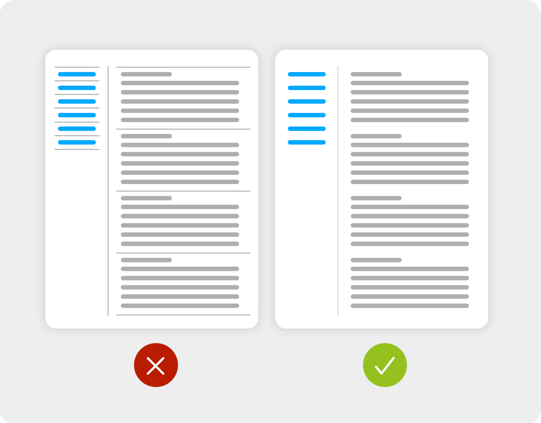
Remove 75% of all the lines and separators you think is needed in your interface. The key is to work with white space to separate different pieces of content. When you start doing this you'll notice that your interfaces will start to feel more uncluttered and clear to the user.
You can find more information about using white spaces in your layouts at https://www.seguetech.com/whitespace-web-design.
Consistent Colors
Make sure to plan your color palette and be restrictive in how many colors you use. It takes skill and knowledge to combine different colors in a good way, so the more colors you use the harder it inevitably becomes. So instead of creating a huge palette of colors, focus on just a few. For starters, try to focus on three colors, a primary color, a complemetary color and a specific color for interactions. The primary color is often the one that the logo is dominated by.
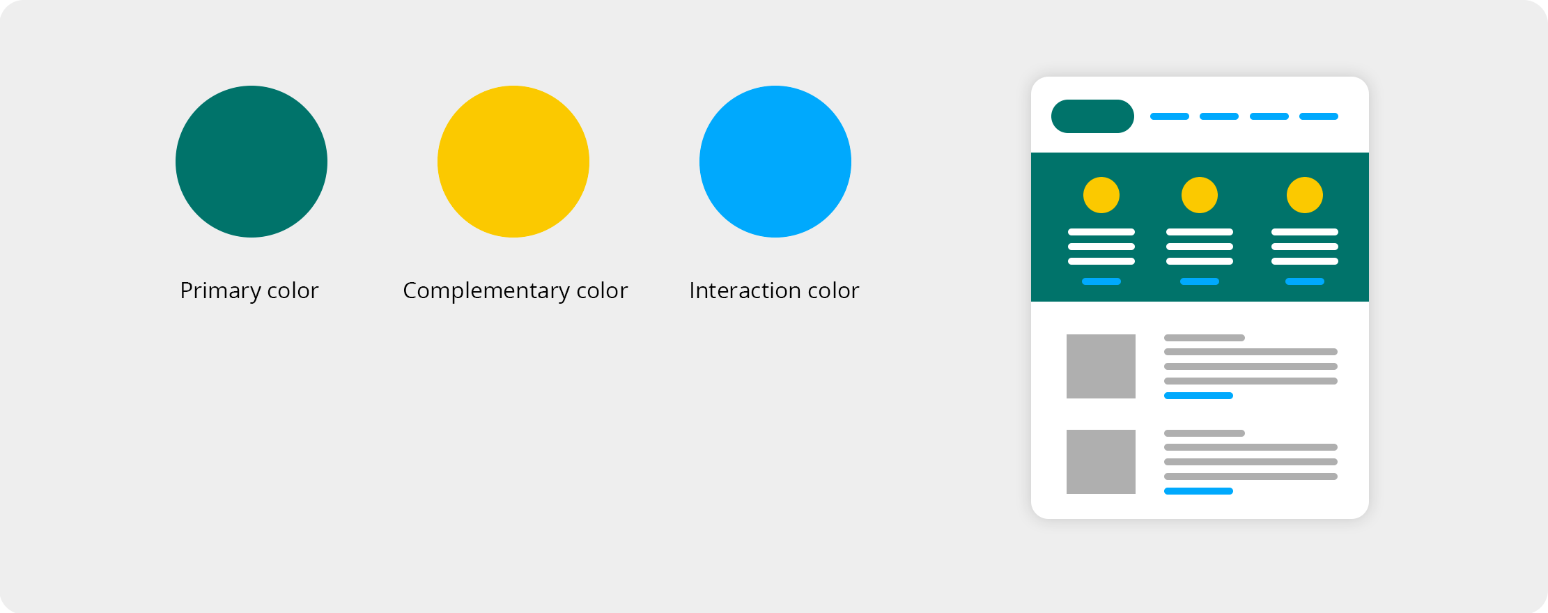
A good online tool for creating a palette can be found at https://colorschemedesigner.com/csd-3.5
Typography
Typography is an art form. Don't complicate things by using obscure fonts that are hard to read. Use a maximum of two different fonts, one for your headings and one for the rest of your content. Don't make the text areas to wide, long lines of text are harder to read. Try not to right align text and make the line height just a little bigger than you think is necessary.
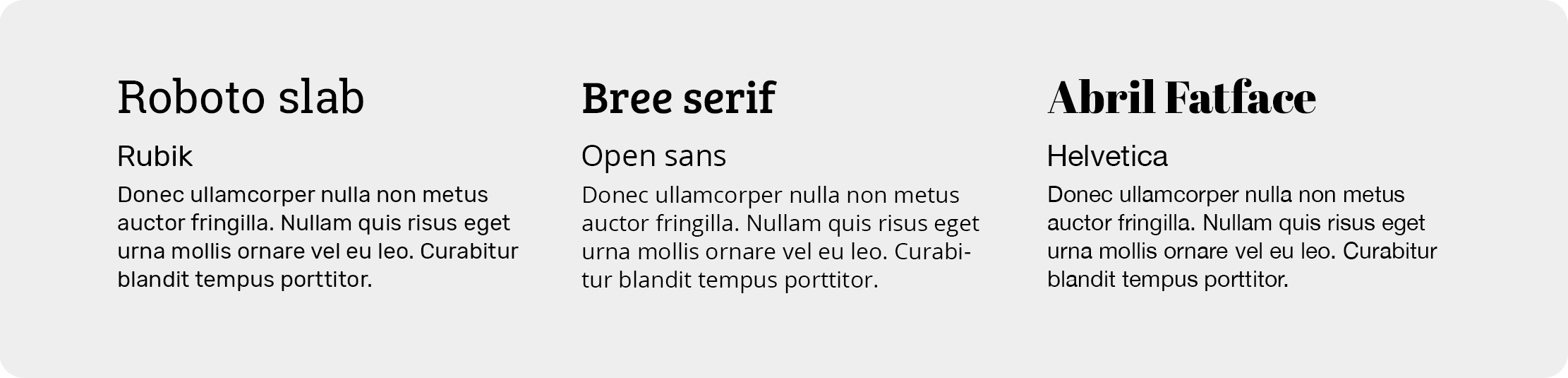
Here's a nice tool for pairing fonts together that matches. https://fontjoy.com
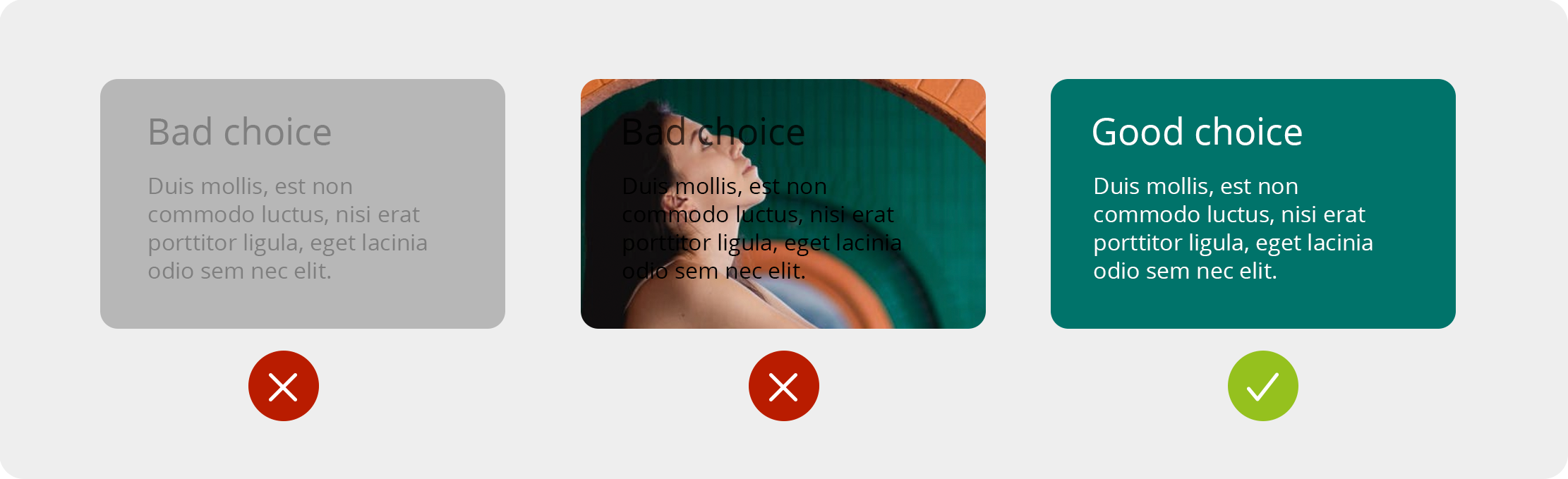
Contrast
Make sure that everyone can read your text by having enough contrast to your background color. Doing this will make your content readable for everyone. In fact, low contrast between your text and the background is hard for eye even for those with perfect vision.
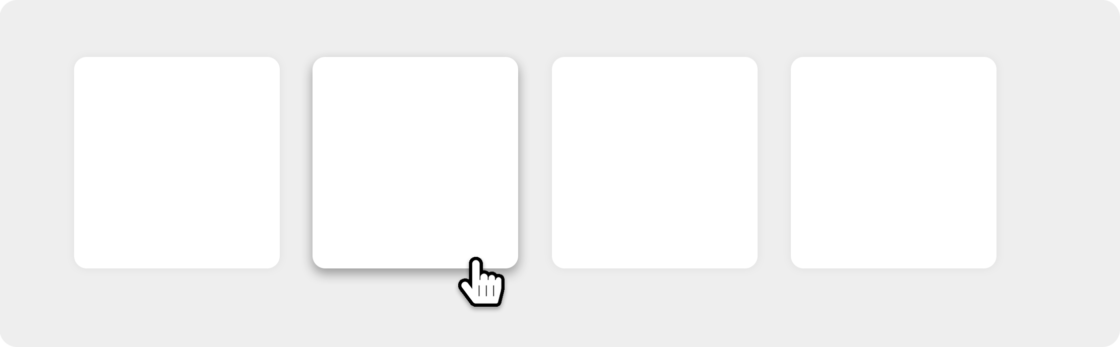
Step Out Of The Shadows
Ease down on the shadows. Yes, they give a nice 3D kind of feel, but too many, and too strong shadows will make your interface messy and hard to read. Use them with care, and only to accentuate important parts of the interface.
You can read more about shadows at https://www.smashingmagazine.com/2017/02/shadows-blur-effects-user-interface-design.
Summary
Don't reinvent the wheel. Try to look at standards that other interfaces build upon. For example, why on earth should you put the main menu in the Site Footer when all of your users will expect to find it in the Header? Putting your logo in the top left corner will almost always do the trick as well. Look at good examples and try to make well grounded decisions.
If you have any questions, thoughts or tips of your own, make sure to comment below!
 About The Author
Niklas Westerström, senior UX and digital designer at byBrick Interface and UX-lead at Piranha CMS.